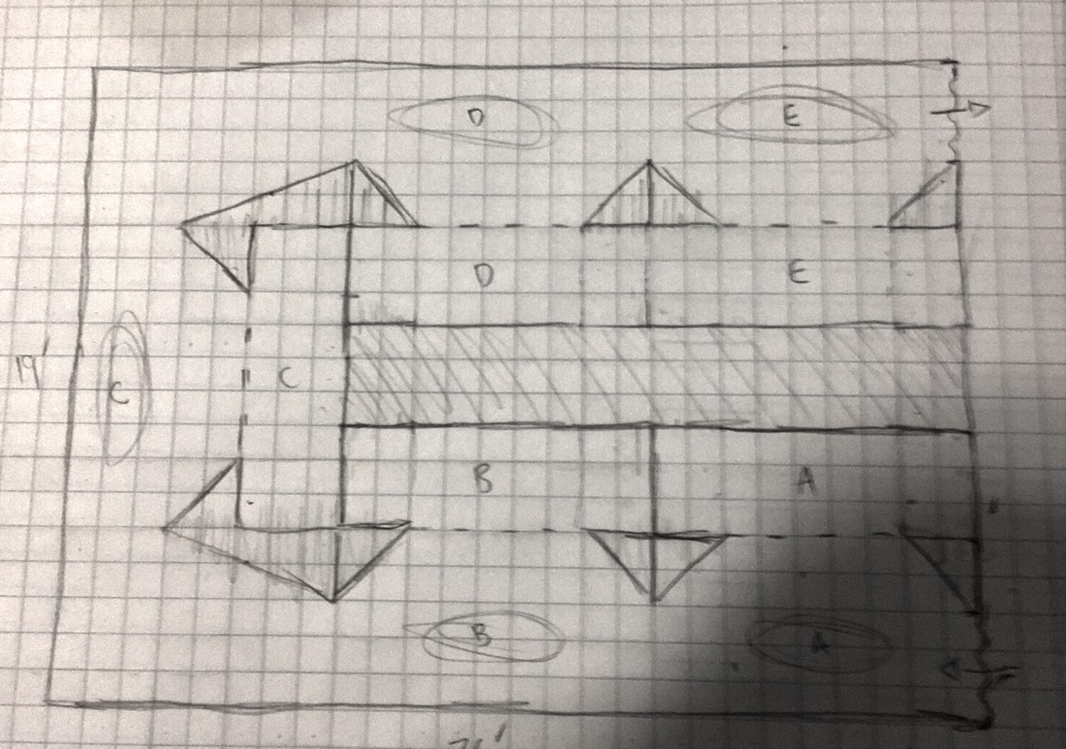
I lost a lot of sleep this week—like, a lot of sleep—because I was keeping myself awake thinking about how to stage this show. Let's start from the beginning:
Graveyard Swing was three scenes, 15' wide, 8' tall, about 5' deep, and about 2' off the ground. They were separated by walls (made of plastic sheeting taped to the otherwise-unused light grid in the theater). The first and last scenes had about 5' of walkway space in front of them, and the middle scene had quite a bit of extra space that was filled with decorations (fog and spider webs). There was also a themed transition from scene 2 to 3: guests walked through a mausoleum entrance.
This show was guided by a human host (me) and accepted one party at a time. The host's spiel probably counts as a cued soundtrack since it was recited in sections based on where guests were in the show, but there were basically no light cues and unfortunately, nothing really moved. By the end of the run I started turning off lights in earlier scenes once guests got to the finale, to discourage backtracking, and Zander would run behind each scene in sequence to pull some strings and introduce some movement.
I want to reduce manual intervention in Bobby's Birthday—the attraction we're building now—which means automating some cues. I'm adding some real animation, and some of it is coordinated with the soundtrack. The soundtrack, in turn, coordinates with guest locations: there's some constant background music, but the pre-recorded narration has to start shortly after guests approach the related scene.
For the longest time, I was expecting to introduce motion detectors or pressure mats—something that flips a switch when people enter a particular space. There would have been one of these in front of each of the five scenes in Bobby's Birthday, which connects to a computer (likely a Raspberry Pi) and orchestrates the soundtrack and animation. This brings us to Wednesday of last week, where I didn't sleep until about 6am.
I already know that each scene lasts about the same amount of time, because I wrote the script in such a way that each scene is the same number of lines in a poem. Assuming a roughly consistent physical distance between scenes and a relatively constant walking speed for my guests, I could just run the whole show in one long sequence, essentially reversing the cause-and-effect: instead of guests entering a space to start a scene, the beginning of the scene will encourage guests to enter its space. This simplifies my tech and equipment costs a lot, and makes the whole show easier to predict: at any point, n minutes after we start the cycle, we know that scene x is running and is y% complete. At the end of the loop, the whole thing can run again.
If the whole thing is running on a loop, we can also put each scene on a loop. Theoretically, all five scenes could play constantly, with a short intermission—that intermission is the cue for guests to move to the next scene, like the "turn the page" chime in read-along books on tape. (Do they still make those? Yes they do!)
If every scene is constantly playing, then we can have five parties in the attraction space at one time, improving throughput significantly. We'd need to separate the scenes a lot to pull this off, avoiding sound bleed and breaking sightlines from one scene to the next. For better or worse, we're building this in NYC, so space is the most expensive asset. A more economical choice might be sound- and light-blocking barriers between the scenes—curtains?
If we have curtains, how do we get people to move between scenes? There could be a light in each scene shining on the curtain, maybe in a fun shape, and we could train our guests before they enter: "When you hear a chime, look for a star to your right. It's shining on a curtain! Open this curtain and walk through to the next scene." This is plausible, but a lot to ask from our guests.
What about motorized curtains? We could use the same technique that we're using to move props on-set to pull back curtains at particular times. What's more, we could offset each scene by 10-15 seconds: the curtain out of scene 5 opens, the guests in scene 5 leave, that curtain closes, the curtain between scenes 4 and 5 opens, and so on, backwards to the beginning, so no party ever sees the party in front of or behind them during the attraction. This is also plausible, but a lot more complicated, error-prone, and expensive.
So, there are five scene scenes which seem most naturally organized in a horseshoe shape: two on each long side and one in the middle. We can use this to our advantage: if every other scene is active at any given time, we only have one active scene on each side of the room. We can ditch the complicated curtain mechanisms and dedicated "go this way" lights, and instead use light and sound cues that already exist in the "next" scene to draw guests forward naturally: if the thing they're looking at is now dark and quiet, but there's a bright and loud thing over there, they'll go over there to that thing.
This is more plausible, but we still might have issues with sound bleed, since we can't guarantee that our space will be sound-dampened, and introducing dampening is tricky. In Graveyard, you could hear the music in scene 3 from everywhere else in the attraction. I used this to my advantage and made it intentional, but I had no real recourse if I didn't want that to happen. Also, if people are talking during the attraction, other parties currently in there will hear them.
We could move to one party every three scenes, meaning a maximum of two parties inside at any given time, which minimizes the problem but doesn't solve it.
Okay! Back to one party at a time. At some point, on a future show, I'll need to improve throughput; while none of the ideas listed here are feasible for this show, in terms of work required or budget, we now have lots of strategies for how to make this better in the future, and that's all we really need for now. This brings us to about Sunday, after a full week of sketching and thinking and not sleeping. Our layout looks like this at the end of all of that:

Throughout this, keeping that floor plan in mind, I took our existing stage prototype and built it up more realistically, adding masking on the front and sides to isolate lighting and keep guests from seeing the edges of the backdrops, for a more finished look:
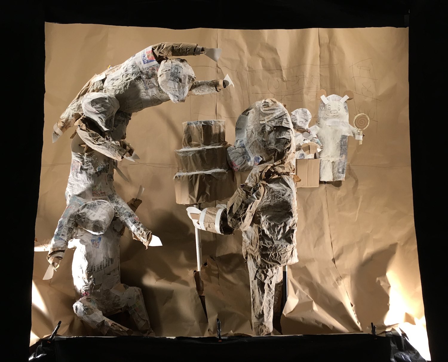
I was excited to see this come together, because this is pretty much how it's looked in my head for months, but something was missing. It feels so…small. It's not small by any means—that opening in the curtain is five feet wide—but it felt too removed, like a tiny window display. As much as I love window displays, that treatment doesn't feel right. Also, as you can see, the lighting in these tight quarters is hard. I'm just aiming for flat, even lighting across the whole thing and painting in shadows where appropriate, but the very front of the scene is totally unlit. This is with four fixtures, one behind each corner of the opening. I could add a fifth behind guests's heads and hope they don't block it, or I could pull that fourth wall forward a bit to have more room for lights (at the expense of some walkway space), but all these options keep the thing feeling cramped.
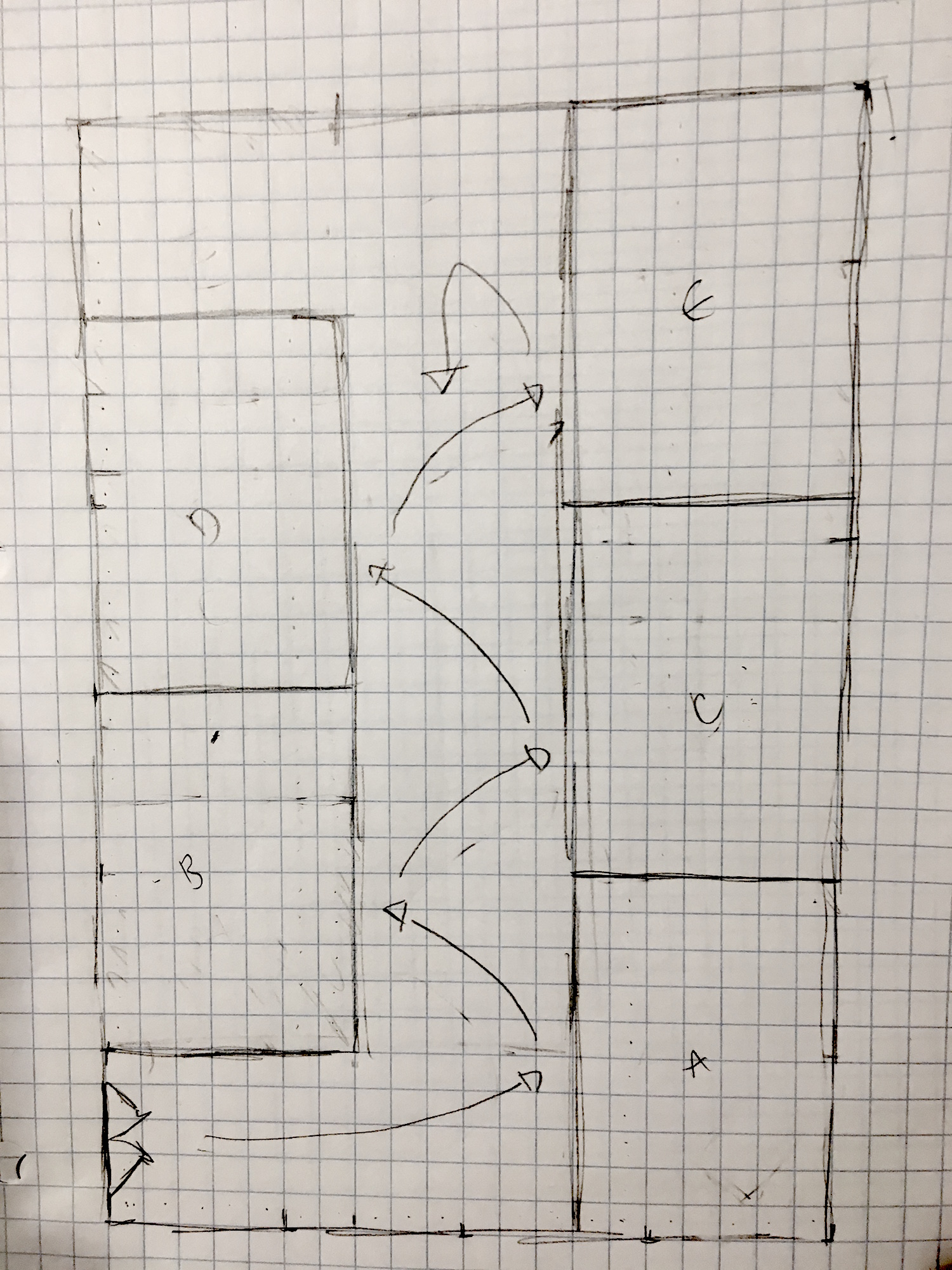
Then I remembered that this is a multiple-parties-simultaneously layout serving a one-party-at-a-time production. At any given time, the whole entire space is dedicated to presenting exactly one scene. This means that I can reuse walking area between scenes, since guests are able to backtrack. Recycled guest area means more stage area. More stage area means I don't need to be so stingy with my lights.
Anyway, late last night I ended up with this floor plan:
And reconfigured the test scene to match it:
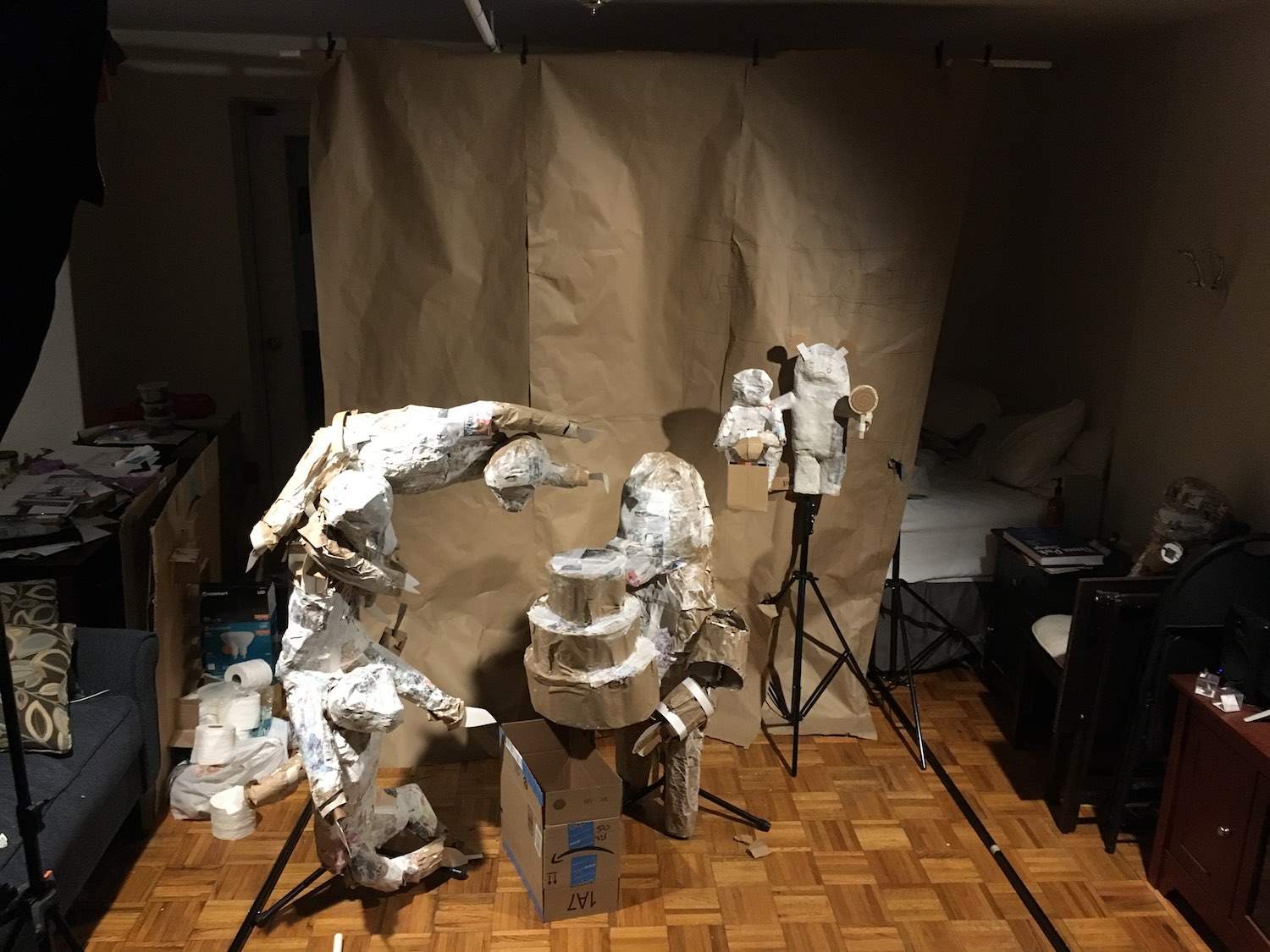
This design also incorporates solutions to some other stuff I was struggling with. Putting a false deck into each scene is a challenge, because it basically means loading a second floor into the show space. It also means all the characters are either putting weight on that floor, which means it can't just be painted fabric on a frame; or suspended directly above it, which makes them less stable, which makes animation more difficult. It also means a lot more masking and curtains, which makes setup time longer (and means more money spent on materials). In this design, characters sit flat on the floor, eventually on top of painted muslin to distinguish the themed space from the pedestrian space. Having no under-deck space potentially complicates some of the animation rigging, but there's still plenty of room behind setpieces to hide that stuff. (You can see a cardboard box on the floor there, standing in for a counter in the bakery.)
So: this attraction will be five scenes. Each one will be about 10' wide, 6-8' tall, flat on the ground. There's a 5' walkway up the center of the space. Guests zig-zag up that walkway as each scene is lit up in sequence, front to back, and then backtrack at the end to exit (which gives them another peek at the whole show before they leave, and perhaps an opportunity for more surprises).
This design is extremely unscalable. Whereas in the earlier layout we could introduce higher throughput with some motorized curtains and soundproof fabric, this one will never be able to accomodate more than one party at a time. I'm totally okay with that! I don't have the budget or expertise of a big theme park, but I can also do things that would never work in that setting. I should take advantage of that freedom.
Phew! Now that we've got this worked out, I'm gonna let the stages rest a while and get back to sculpting and animation. See you next week!