Re-Reader
A stripped-down re-style of Google Reader by John Holdun
I didn’t think I would like Google Reader when I first tried it. I don’t even remember how long ago that was, and I haven’t looked back since.1
Even though my usage seamlessly shifted from trial to permanence, there were some things I didn’t love. I found myself squishing my window down to fix items’ body measure, which led to too-narrow viewing for any other tabs. I’d seen things like Helvetireader, which is quite lovely, but still doesn’t solve my problems. I wanted the ease of use I had with Reader, combined with a visual experience more like Readability or Instapaper. Now I have it.
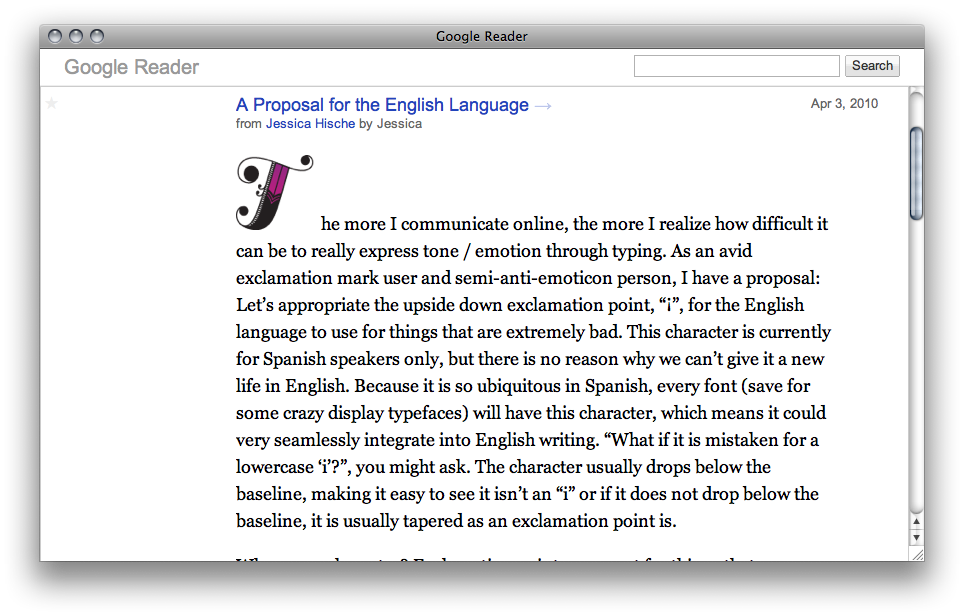
 This is not a drastic re-design. I decreased measure, increased font size and line height, and switched to a serif typeface for entry bodies. Expanded entries no longer show their collapsed views’ redundant title/summary lines. The UI junk is gone. All that remains is search, entries, and stars (which also look a bit different, a little nicer). Expanded entries that are marked as unread get a soft yellow background, as I am often unsure if my keypress (M) actually did anything.
If you are interested, you may install the style as a userscript, download the stylesheet, or use the bookmarklet to swap on the fly: Re-Reader (drag it to your bookmark bar). I refer you again to Helvetireader for detailed installation instructions.
It’s not perfect yet. Search results look a little screwy. The expanded view isn’t terrible, but the sidebar apparently always disappears. If you don’t know the keyboard shortcuts, this isn’t for you. (If you want to learn them, hit your “?” key in Reader, regardless of whether you’re using an alternate stylesheet.)
I might fix search, but don’t expect any of these things to ever change. I built this for the way I use the application and therefore, for me, it is a perfect thing. If you want to enhance it, you have the stylesheet; I would be nuts to try to protect these few lines of CSS so consider this GPL or Public Domain or whatever it is I need to declare to allow you to rip it off without guilt.
Did I miss something? I’m not surprised. I’m @johnholdun and I’m also john@johnholdun.com. Talk to me.
 This is not a drastic re-design. I decreased measure, increased font size and line height, and switched to a serif typeface for entry bodies. Expanded entries no longer show their collapsed views’ redundant title/summary lines. The UI junk is gone. All that remains is search, entries, and stars (which also look a bit different, a little nicer). Expanded entries that are marked as unread get a soft yellow background, as I am often unsure if my keypress (M) actually did anything.